Chapter 1.3.4 - Box Model
Box Model
In HTML, elements are classified either block- or inline-level. This has to do with how the elements are displayed.
| type of level | description |
|---|---|
| block |
|
| in-line |
|
Display
You can change how an element is displayed through the display property. Every element has a default display property but it can be overwritten to be block, inline, inline-block, and none.
p {
	display:block;
}
A value of
blockwill make that element a block-level element.
p {
	display: inline;
}
A value of
inlinewill make that element an inline-level element.
p {
	display: inline-block;
}
With the
inline-blockvalue, the element behaves as a block-level element, accepting all box model properties; however, the element will be displayed in line with other elements, and it will not begin on a new line by default.
Paragraph one.
Paragraph two.
Paragraph three.
Three paragraph elements displayed
inline, sitting right next to the other in a horizontal line.
div {
	display: none;
}
An element displayed as
nonewill not appear on the page.
What is the Box Model?
Every element on a page is a essentially rectangular with a width, height, padding, borders, and margins.

You can see in the above example that all elements are rectangular, regardless of their shape.
Working with the Box Model
Every element has a set of properties which determine its size.
| property | description |
|---|---|
display | could determine width and height |
width and height | explicit length of width and height values |
padding and border | expand the dimensions of the box outward from the element's width and height |
margin | any margins specified follow the border |
Each part of the box model corresponds to a CSS property.
div {
	border: 6px solid #9495599;
	height: 100px;
	margin: 20px;
	padding: 20px;
	width: 400px;
}
We can calculate the width of the hypothetical element above with the following formula:
margin-right + border-right + padding-right + width + padding-left + border-left + margin_left. The total height of an element can be calculated using the following formula:margin-top + border-top + padding-top + height + padding-bottom + border-bottom + margin-bottom.
- Width:
492px = 20px + 6px + 20px + 400px + 20px + 6px + 20px - Height:
192px = 20px + 6px + 20px + 100px + 20px + 6px + 20px
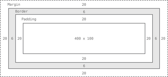
The box model for the previous example, visualized.
Each property has a different way of interacting with the content surrounding it.
| property | description |
|---|---|
width |
|
height |
|
margin |
|
padding |
|
Shorthand and Longhand
The margin and padding properties come in both longhand and shorthand from. When using the shorthand margin property to set the same value for all four sides of an element, we specify one value:
div {
	margin: 20px;
}
To set one value for the top and bottom and another for the left and right sides, specify two values: top and bottom first, then left and right.
div {
	margin: 10px 20px;
}
You can specify unique values for all four sides by specifying them in order of top, right, bottom, and left, moving clockwise.
div {
	margin: 10px 20px 0 15px;
}
Any of these options are considered shorthand. Longhand involves explicitly stating the property and side you would like to modify.
div {
	margin-top: 10px;
	padding-left: 6px;
}
In the above example, we set our
margin-topproperty value to be10pxand ourpadding-leftproperty to be6px;
It is best to use longhand notation when we wish to identify only one margin or padding value. This keeps our code explicit and helps us avoid any confusion.
Border
The border property requires three values: width, style and color. Shorthand values for the border property are stated in that order--width, style, color. In longhand, we break these three values into the border-width, border-style and border-color properties. They are useful for overwriting a single property value.
The most common border styles are solid, double, dashed, dotted, and none.
Just like the margin and padding properties, border has highly specific longhand sub properties. These highly specific longhand border properties include a series of hyphen-separated words starting with the border base, followed by the selected side—top, right, bottom, or left—and then width, style, or color, depending on the desired property.
div {
	border-bottom: 6px solid #949599;
}
In the above example, we created a border solely on the bottom side of the
divelement.
div {
	border-bottom-width: 12px;
}
Styles for individual border sides may be controlled at a fine level. In the above code, we change the width of the
bottomborderto12px.
To round the corners of border, we use the border-radius property. This property accepts length units, including percentages and pixels, that identify the radius by which the corners of an element to be rounded.
Similarly to the margin and padding shorthand notation, we can specify the radius of all corners equally by giving one value, the radius of top/bottom and right/left with two, and the radius of individual corners with four values, going in a clockwise direction.
div {
	border-radius: 5px 0 15px 20px;
}
In the above example, we set the radius of the
top-left,top-right,bottom-right,bottom-leftcorner to5px,0,15px, and20pxrespectively.
You may even set the individual border-radius of a corner usingborder- followed by a specific corner and the word radius.
div {
	border-top-right-radius: 5px;
}
In the above example, we change the
radiusof thetop-rightcorner to be5px.
Box Sizing
We have discussed the the additive nature of the box model where width, padding and border contribute to the overall width of an element. CSS3 introuced the box-sizing property which allows us to change how the box model works and in turn how an element's size is calculated. The three primary values it accepts are content-box, padding-box, and border-box.
Content Box
The content-box value is the default value.
Padding Box
The padding-box value alters the box model by including the padding property values within the width and height of an element. When using the padding-box value, if an element has a width of 400 pixels and a padding of 20 pixels around every side, the actual width will remain 400 pixels. As any padding values increase, the content size within an element shrinks proportionately.
If we add a border or margin, those values will be added to the width or height properties to calculate the full box size. For example, if we add a border of 10 pixels and a padding of 20 pixels around every side of the element with a width of 400 pixels, the actual full width will become 420 pixels.
div {
	box-sizing: padding-box;
}
Border Box
The border-box value alters the box model so that any border or padding property values are included within the width and height of an element. When using the border-box value, if an element has a width of 400 pixels, a padding of 20 pixels around every side, and a border of 10 pixels around every side, the actual width will remain 400 pixels.
If we a margin, those values need to be added to calculate the full box size.
>No matter which box-sizing property value is used, any margin values will need to be added to calculate the full size of the element.
div {
	box-sizing: border-box;
}
Generally speaking, the best box-sizing value to use is border-box. The border-box value makes our math much, much easier. If we want an element to be 400 pixels wide, it is, and it will remain 400 pixels wide no matter what padding or border values we add to it.
box-sizingis not supported in every browser so if you encounter displaying issues, consider this a potential source of error.